A logo captures the spirit of your brand. It should be simple, recognizable, and as unique as possible. This guide covers design principles that will help you or your designer find the visual essence of your organization.
Find your message
The best logos say something about an organization’s beliefs.
Customers can sense when a brand has a message. Your message should permeate all aspects of your marketing, beginning with your logo.
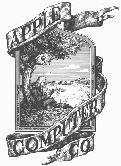
Apple’s original logo featured an apple falling on Isaac Newton. The logo represented simplicity and “a mind forever voyaging.” The visual representation changed the following year, but the concept stayed the same. The message was timeless.
Customers can identify their favorite brands after a logo change because the brand’s message endures. This is why it’s vital to identify what you want to convey in your logo.
Your message doesn’t need to be explicit. It can be abstract. But it needs to be present.
Focus on feeling
Drive around your city and it’s easy to find local businesses with logos that are essentially icons for the services they provide. If your brand aspires to be more than just a commoditized service, avoid making your logo into a “service icon.” Instead, create a design that represents a feeling.
This feeling can be the emotion customers experience after using your service. BP’s sun rays are meant to suggest harmony with nature and the optimism in using “better energy.”
The feeling can be the spiritual value of the transformation you bring to people’s lives. Disney’s cursive script represents the spirit of entertainment and the transformation of a joyful family experience.
It can also be an idea your organization represents. Nike’s fluid smoosh is reminiscent of a checkmark, reinforcing the idea behind their brand: “Just do it.”

Explore ideas from other brands
Start with collecting logo references from inside your industry. Every industry has different logo trends. Tech companies favor minimalism. Fitness companies usually convey movement through italicized text or an angled graphic element.
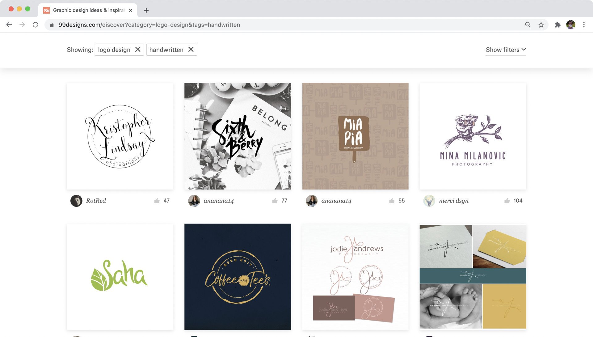
It can also be useful to see fresh logo designs that aren’t already famous, including designs outside your industry. LogoPond and the 99Designs Discover gallery both display a wide array of inspirational logo designs.

Look for negative space
Negative space is the “white” space around your logo’s graphics. Any logo should have a visually pleasing amount of “breathing room” around the design so that it doesn’t feel cluttered. An extraordinary logo can often create new meaning using the “white space” inside the logo’s shapes.
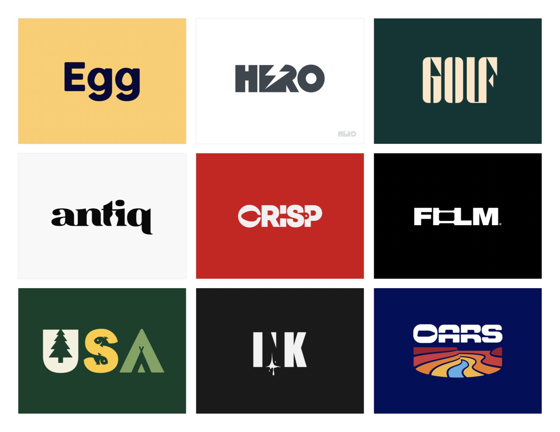
Row 1: Leo, unfold , Viet Huynh.
Row 2: Aditya, Aditya, Alex Aperios.
Row 3: Allan Peters, Antonio Calvino, Dan Fleming for 829 Studios.
Use custom type
If you plan to write the name of your company in the logo, custom typography will make it difficult for other companies to replicate the look of your design.
Typography fits into four categories:
- Serif looks like the font in a typical book. It includes small strokes at the ends of larger strokes.
- Sans serif is minimalist, with no serifs or decorative features.
- Script resembles hand writing.
- Decorative type is illustrative and unique.
Many logos use one of these popular fonts as a springboard. They then make slight modifications to the font or add their own unique twist.
- Avenir, used by Bloomberg and Spotify
- Bodoni, used by Vogue and Calvin Klein
- Clarendon, used by Sony and Wells Fargo
- Cocon, used by Shozu
- Didot, used by Giorgio Armani and Vogue
- FF Dax, used by UPS and VakıfBank
- Frutiger, used by Flickr and Panda Express
- Futura, used by Nike and Dolce & Gabbana
- Garamond, used by Rolex and Abercrombie & Fitch
- Gotham, used by Chipotle and Disqus
- Helvetica, used by CBS, Jeep, LG, Microsoft and Target
- Optima, used by Estée Lauder and Aston Martin
- Proxima Nova, used by BuzzFeed and NBC News
- Times New Roman, used by Wikipedia
- Univers, used by eBay and Unicef
Incorporate movement
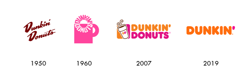
Twitter’s logo evolved from a perched bird to a flying bird to a bird flying upwards. Each evolution made the design feel more alive.

Make your logo read in 32 pixels
Once you’ve designed something thoughtful and beautiful, ask yourself: What can I take away?
Today logos trend towards flat color and minimalist detail. Usually, the more iconic the brand, the simpler their logo. Think of the Nike swish or the “D” in Disney.
Logo designers typically test their designs at 32 x 32 pixels to see how well a design holds up. Is it still recognizable? Does it still make an impact?
Even if you decide to go with a more elaborate logo, you’ll still need simplified variant for tiny placements, such as a website favicon or social media icon. This will challenge you to choose one unique element that can read even in the smallest of image sizes.
Create consistency
A well designed logo avoids arbitrary shapes. Use a grid to bring balance to your design.

Know your brand
Your brand distinguishes your organization from your competition and links your product to your organization in the mind of your customer. When you release a quality product, and you have strong branding behind it, you have the opportunity to build brand loyalty – one of the best assets your company will gain from that product.
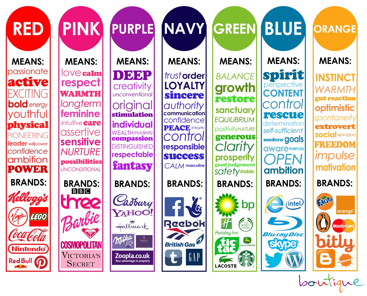
Think of your brand as a personality for your organization. To define your brand personality, you’re welcome to take our free brand personality test. The test will help you to clarify your organization’s style, the role you play in your customers’ lives, and your customers’ perceptions of your business.
Share the result of the test with your logo designer and branding specialist. It will help your designers select suitable shapes, colors, and design styles to best represent your organization.
Keep designing
Typically your first idea is the most generic. A number of people in the same culture will have similar first ideas.
Challenge yourself to keep searching until you find something that will make your logo memorable.